Color token

change it once. Everything updates.

Light Mode was the most-requested feature — but delivering it meant rebuilding a fragmented 60+ color system from the ground up into a scalable semantic framework that works across dark and light, desktop and mobile.

READ RELEASE ↗
project
WOO X Light Mode
role
Product Design Lead
year
MAR – JUL 2025
team
4, cross-functional
base colors before
0+
fragmented, no semantic structure
reference tokens after
0
mapped to dark & light system tokens
timeline
0
months from kick-off to launch

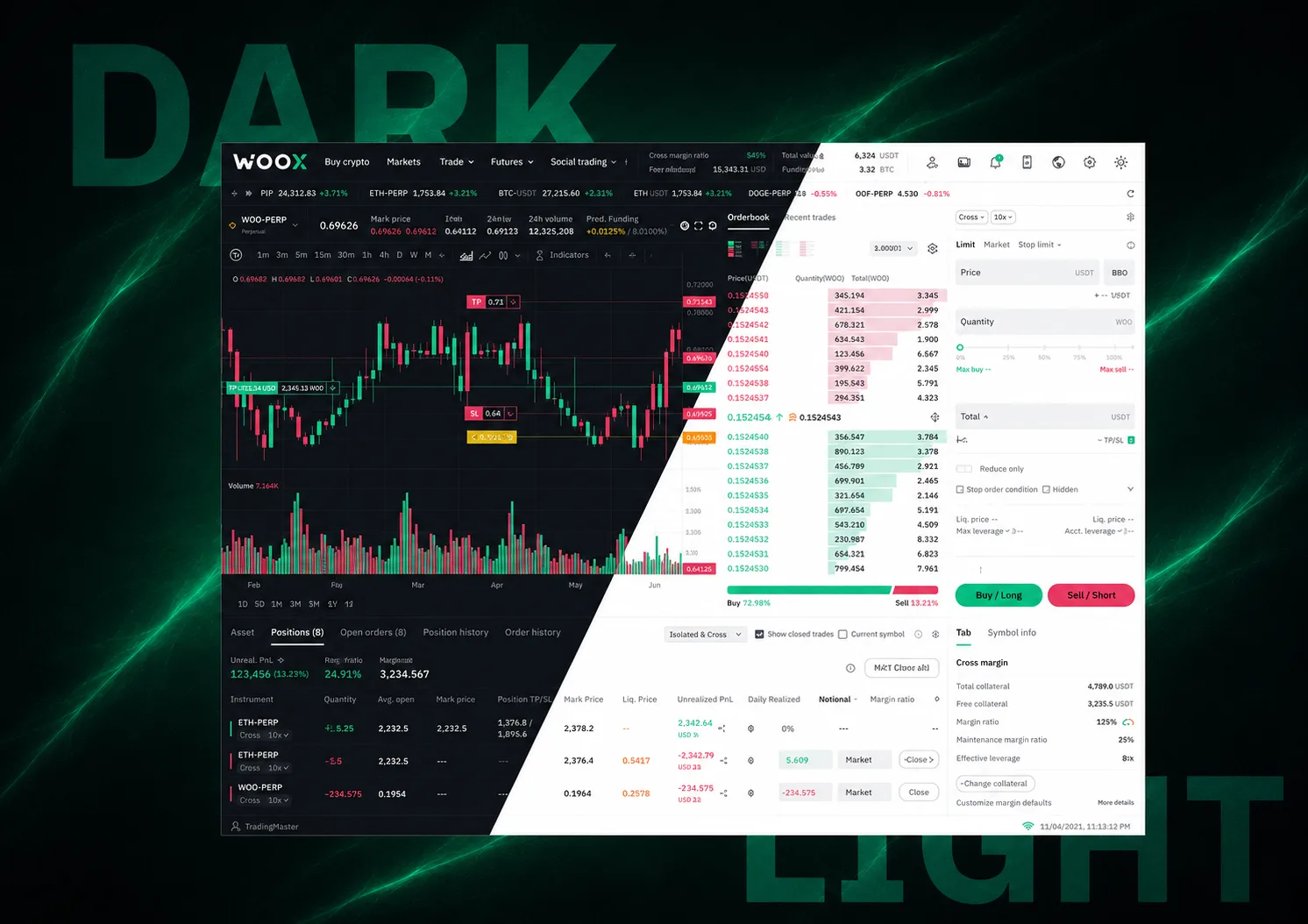
Light Mode was the long-lasting request

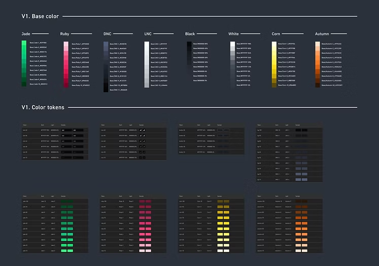
Light Mode was consistently the most-requested feature on WOO X. But when we looked at what it would take to build it, the real challenge became clear: the existing design system had over 60 base colors with no consistent usage patterns and no semantic structure. You couldn't reliably map dark values to light equivalents because there was no underlying logic to map from.

Delivering Light Mode without fixing the foundation would have meant hardcoding workarounds that would break the next time anyone touched the UI. So the project became two things at once: ship a highly requested feature, and rebuild the color system underneath it.

Three core challenges
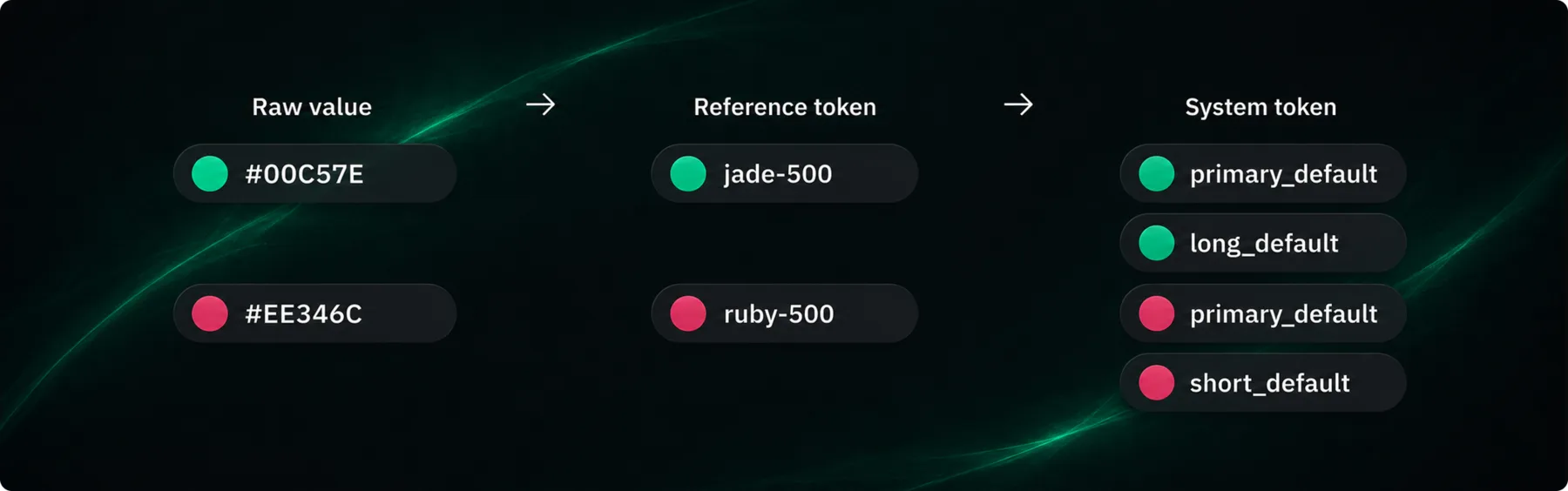
  • Consolidation: Reduce 60+ fragmented base colors into a manageable, semantic token system
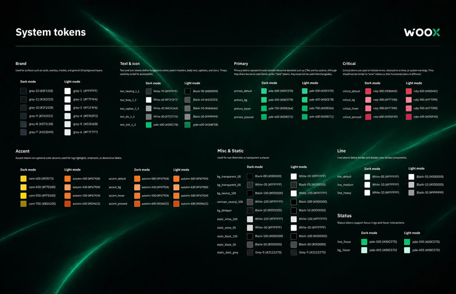
  • Accessibility: Ensure adequate contrast and readability across dark and light modes on all surfaces
  • Brand continuity: WOO X's signature green was designed for dark backgrounds — adapting it for white without losing brand identity
WOO X Light Mode — before and after

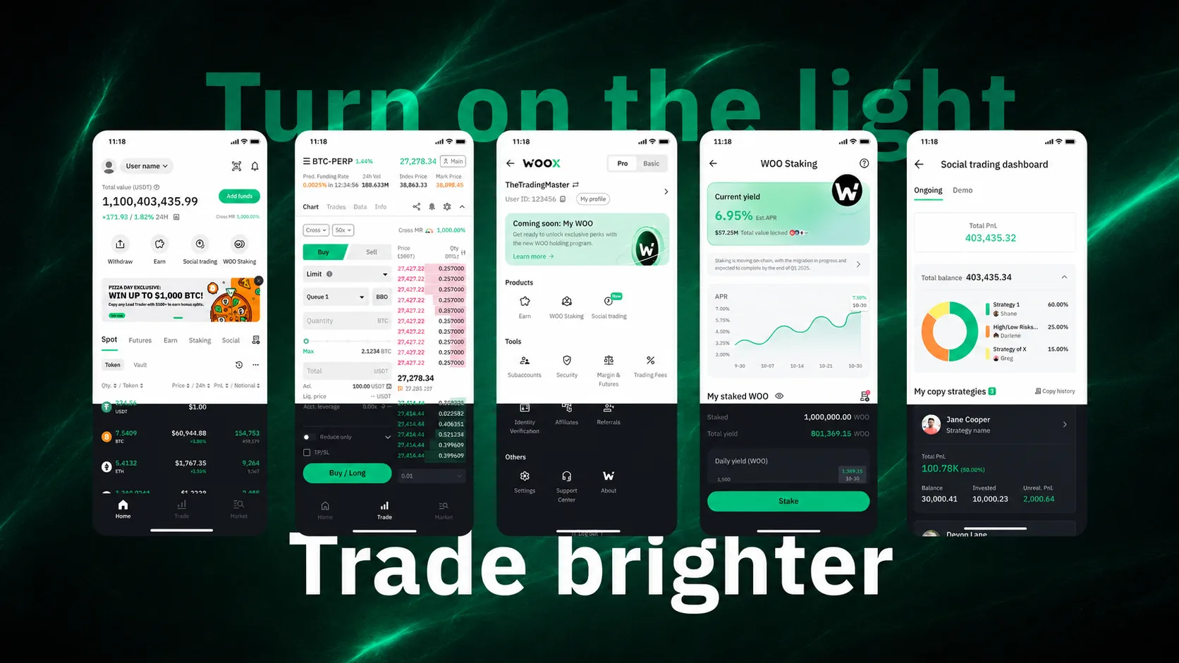
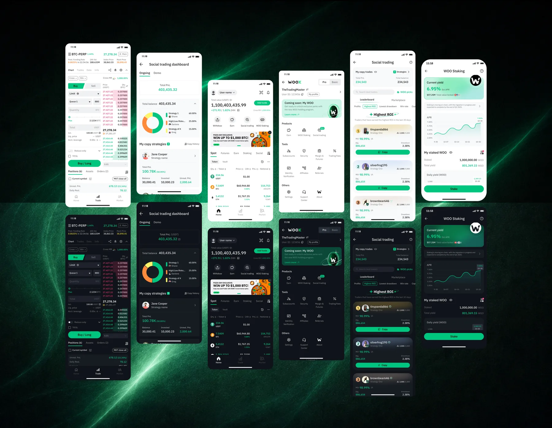
Light Mode — full platform rollout across desktop and mobile

A brand built for dark — adapting it for light

WOO X's brand palette was built around black backgrounds with a signature green as the primary action color. On white, that green read as unpleasant — too saturated, too aggressive, and out of step with the calmer tone a light interface requires.

Rather than waiting for a brief, I proactively aligned with the brand team, who were undergoing rebranding, to guide the adjustment. The goal wasn't to change the brand — it was to create a UI-appropriate variant that preserved recognition while improving readability and visual comfort on light backgrounds. That conversation also set a precedent: design system decisions need brand sign-off, not just engineering review.

From 60 base colors to a semantic system

The existing system had designers scrolling endlessly in Figma just to find the right shade — and still making inconsistent choices. The fix wasn't adding more documentation. It was structural.

We consolidated 60+ base colors into 30 reference tokens, each mapped to a semantic system token that carries intent — not just a hex value. The two-layer architecture means changing a reference token applies automatically through every surface that references it, in both dark and light contexts.

Before — 60+ fragmented base colors

Before — 60+ base colors with no semantic structure, inconsistent usage across products

After — two-layer semantic token system

After — reference tokens mapped to semantic system tokens with dark/light variants

Token architecture — reference and system layers

Token architecture — two semantic layers designed for extensibility

The Long/Short trading token decision

Long and Short positions had been sharing the Primary (green) and Critical (red) tokens. This created an implicit dependency: if anyone ever changed the primary brand color, it would also change how buy and sell were displayed — a serious financial UX risk.

I separated Long/Short into dedicated trading tokens, isolated from the broader system. This ensures that future brand or theme changes never accidentally affect how trading direction is communicated to users. The separation also opens the door to a future preference toggle: in several Asian markets, long is red and short is green — the inverse of Western convention — and the system can now accommodate that without touching brand tokens.

WOO X Light Mode — full platform view

Progressive rollout, zero regressions

Engineering's initial proposal was to batch-replace all color values in one pass. The risk was significant — edge cases in complex components, particularly trading charts and order panels, could break silently without visual regression testing at scale.

I coordinated a gradual migration approach instead: map old tokens to new tokens incrementally, validate each surface before expanding coverage, and sequence the rollout to contain risk.

Rollout sequence
  • Token mapping: Old tokens mapped to new semantic equivalents — no raw hex values in components
  • Mobile first: Launched on mobile to learn edge cases in a lower-stakes context before web
  • Progressive exposure: Internal testing → 10% of users → 50% → 100% full rollout

What used to take months now takes an afternoon

Before the new system, any color change that involved specialized components — charts, trading panels, order books — required coordinated engineering effort. Changing a brand color could take months of development time across multiple teams.

With the semantic token architecture in place, designers can now update a reference token in Figma and validate the visual result on a real device without touching engineering. The system does the propagation automatically.

WOO X Light Mode — desktop view

WOO X Light Mode — full desktop rollout across trading, portfolio, and account surfaces

The token system didn't just enable Light Mode. It changed how the team makes color decisions — permanently.

"Choosing colors is now intuitive — I don't have to scroll endlessly to find the right shade."
— Jin, Product Designer, WOO X
"I love this light mode. Maybe my trades would be brighten."
— Luke, Trader, post-launch feedback

One feature request, one systemic change

Light Mode started as a response to user demand. It became a case study in using concrete feature requests as leverage for broader structural change — something that's harder to get alignment on when proposed in the abstract.

The token architecture we built doesn't just support dark and light modes. It creates the foundation for any future theme, brand refresh, or color system evolution. What could have been months of engineering for each change is now a Figma update.

The deeper lesson: design maturity isn't built through process documents or design principles decks. It's built when a tangible deliverable forces the organization to confront its technical debt and align around a better way of working.