One screen

every signal, every action, without scrolling once.

A mobile trading experience redesigned around the active trader's most critical need: acting on opportunity without switching screens.

OPEN APP
project
WOO X
role
PM + Design Lead
year
MAR – MAY 2023
team
3, cross-functional
satisfaction score
0.00 / 5
up from 3.5 before launch
survey responses
0
in-app responses within 3 months
timeline
0
months from kick-off to launch

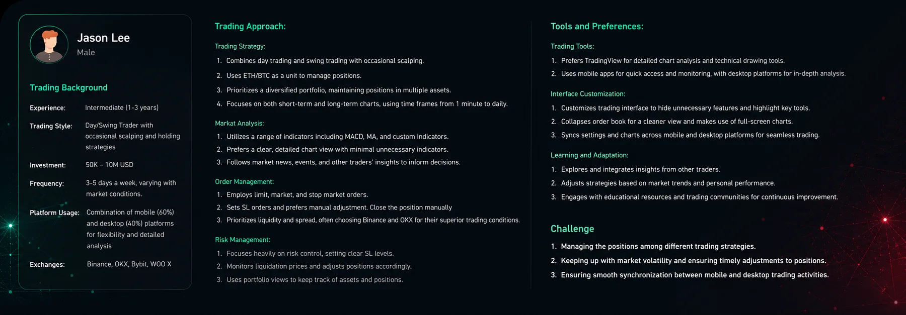
The active trader problem

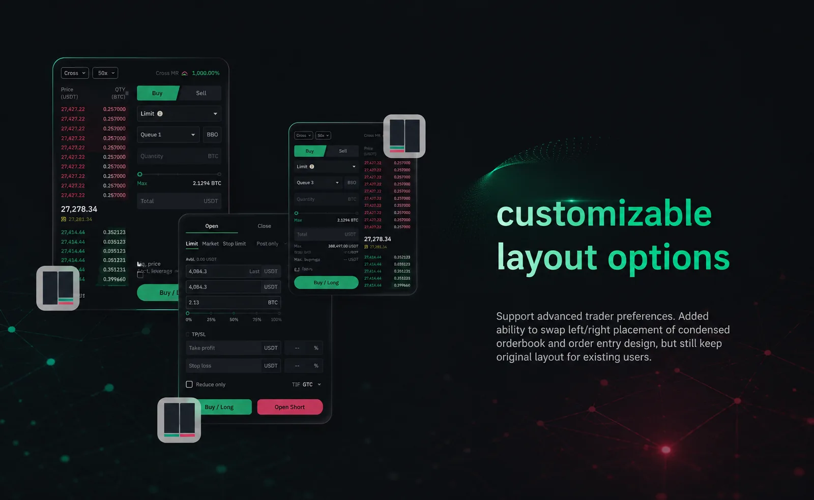
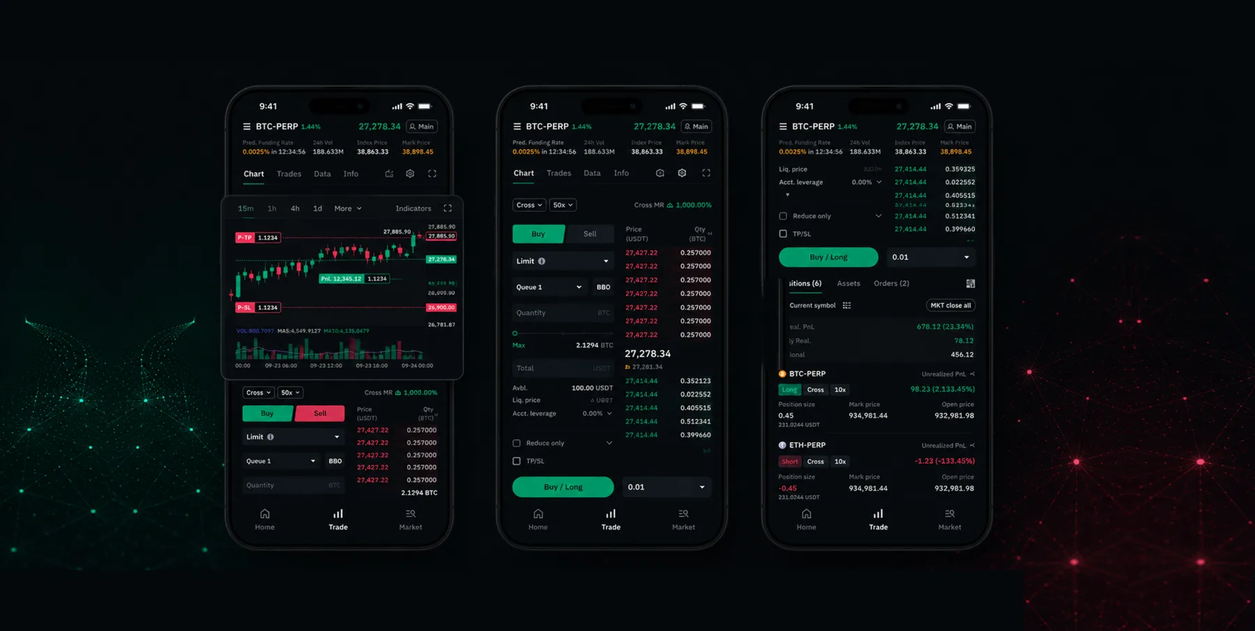
WOO X was built for professional traders — but its mobile interface wasn't keeping up. To place a single trade, an active trader had to navigate across at least four screens: charts, order book, trade panel, and position summary.

This wasn't a feature gap. It was a structural problem. And it showed up in our OKR review: satisfaction scores were kept low despite improvements elsewhere.

What we were trying to solve
  • Pre-trade: Help users identify opportunities faster
  • During trade: Enable fast, seamless execution once an opportunity is spotted
  • Post-trade: Give clear tools to review and adjust positions
OKR pyramid diagram

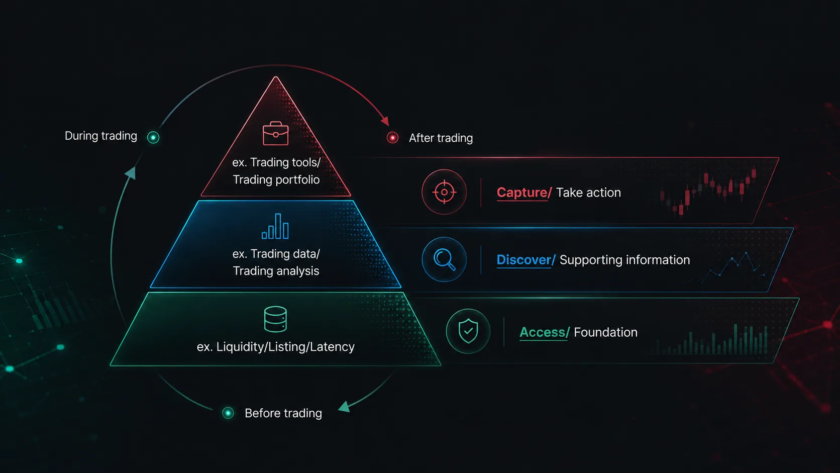
OKR alignment workshop — defining the three trading behaviour focuses

Three bets based on my understanding on users

Before recruiting, we wrote down our assumptions to validate. This forced us to be honest about what we believed — and what the research needed to prove or disprove.

Hypothesis 1

WOO X mobile requires more time than competing platforms for active traders to identify and act on a trading opportunity.

Hypothesis 2

Active traders have already formed strong UX expectations from primary competitors — WOO X needs to meet, not reinvent, those conventions.

Hypothesis 3

Traders prefer to see candlestick charts, the order book, and the trade panel simultaneously on a single screen.

Five traders. Three hypotheses. All confirmed.

We recruited through a screener survey and ran structured interviews with five active traders — two internal experts and three VIP users. Each 60-minute session walked participants through a complete trading journey on both WOO X and competing platforms.

Jason — user persona for active crypto trader

Jason — user persona synthesised from research interviews with active traders

What we found
  • H1 confirmed: Multi-screen navigation caused real delays — users described "losing the moment" between screens
  • H2 confirmed: Users expected quick-order defaults; WOO X lagged behind the UX conventions traders already knew
  • H3 confirmed: Integrated trading data and UX was valuable to every trader type, not just the most active ones

First-view trading — the strategy

The research gave us a clear instruction: every critical piece of information and every critical action had to be visible without scrolling. We named this principle "First-view Trading" and used it as the filter for every design decision that followed.

Design execution was led by Hazel, our Product Designer. My role was to translate research findings into design direction, review each iteration against the First-view Trading principle, and define acceptance criteria for each feature. Four outcomes shaped the final product: a unified single view, consolidated order management, enhanced chart interactions, and a configurable layout.

Single view — chart, order book and trade entry on one screen

Single view — chart, orderbook, and entry in one

Unified orders — active positions and pending orders in a single view

Unified orders — positions and pending merged clearly

Chart actions — order markers and indicators integrated into chart view

Chart actions — order markers & indicators enhanced

Custom layout — user can swap order book and trade panel positions

Custom layout — swap orderbook & entry placement

"I no longer need to scroll endlessly to place an order."
— WOO X VIP trader, post-launch survey
"Seeing my trades directly on the chart makes everything more intuitive."
— WOO X VIP trader, post-launch survey
WOO X Trading Revamp — product overview

Satisfaction from 3.5 to 4.71

Three months after launch, we collected 370 in-app survey responses. Users rated their experience on a 1–5 scale, selected which trading features still had friction, and could leave open-ended comments.

The score moved from 3.5 to 4.71 — across a respondent pool that included WOO X's most demanding users.

The in-app survey wasn't just a measurement tool. It was research infrastructure — built to tell us where to go next, not just how far we'd come.

Retrospective on what we did

The risk of confirming what you already believe

All three hypotheses were validated — which felt like a win, but also a signal worth examining. We recruited from internal experts and VIP users who were already close to the product. A broader pool — including churned traders — might have surfaced friction we didn't know to look for. Next time: build in at least one segment that challenges your assumptions rather than confirms them.

The in-app survey was the underrated win

Most of the team saw the survey as a measurement mechanism. I designed it as research infrastructure: structured rating scales, friction category selectors, and open-ended fields — so we'd know not just the score, but where to focus next. That kind of forward-looking instrumentation is something I will build into every project from day one.